The world may soon look different in classrooms, atlases and public spaces after the United Nations backed a push for more geographically accurate ways of depicting the planet. 164 countries voted for the new map over the Mercator map, with United States the only country voting against the resolution.
At the heart of the debate is the Mercator projection, the familiar rectangular world map that has shaped how generations have visualised Earth.
Created by Flemish cartographer Gerardus Mercator in 1569, the Mercator projection was never intended to provide a perfectly accurate picture of the size of countries. Its great strength was navigation; it preserved angles and made it easier for sailors to plot courses. But the same mathematical design creates serious distortions in landmass size, particularly as they move farther from the Equator.
This is why Greenland, Canada and Russia appear enormous on a Mercator map. Greenland, for instance, can look comparable in size to Africa. In reality, Africa is around 14 times larger than Greenland.
That distortion has become increasingly controversial because maps do more than help people navigate—they influence how people understand the world.
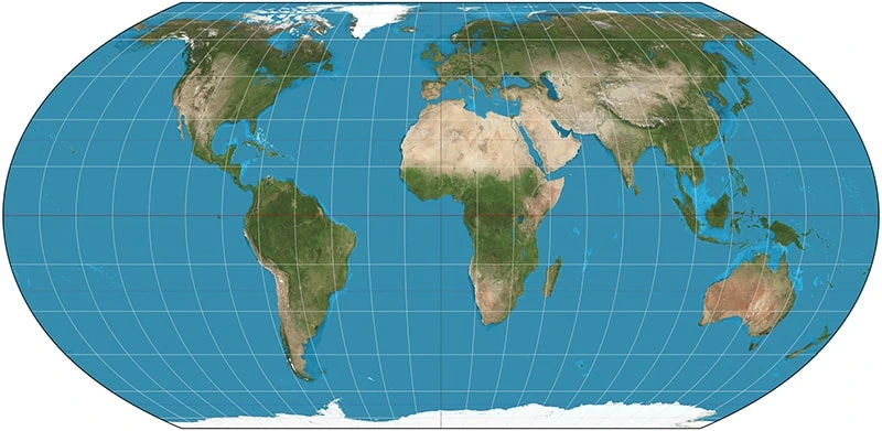
The alternative receiving growing attention is the Equal Earth projection, developed in 2018 by cartographers Bojan Šavrič, Tom Patterson and Bernhard Jenny. Unlike Mercator, Equal Earth is an equal-area projection, meaning the relative size of continents is preserved far more accurately.
On an Equal Earth map, Africa immediately looks closer to its true scale. Europe and North America appear smaller than they do on Mercator, while Greenland loses its exaggerated appearance. The result is a map that provides a more realistic visual comparison between the world’s continents.
The push for change has particular significance for African countries. Supporters argue that conventional world maps have visually reduced the apparent size of Africa while magnifying Europe and other northern regions. Since Africa is geographically enormous, showing it at a more accurate scale can challenge misconceptions about the continent’s physical size and global geography.
The planet itself has not changed. Africa has always been huge, Greenland has always been much smaller, and Europe has always occupied the same geographical position. What could change is the picture hanging on our walls—and with it, our understanding of the world.

